At the end of "Drawing as Translation", I said that omission and exaggeration are not deceit. Instead, they're ways to overcome the restrictions posed by the language of line drawing, optimising the drawing to compensate for these restrictions. In this essay, I'll talk about two papers I found that support this. I'll then link it with the "generalised inverses" and "adjunctions" that I introduced in "Drawing as Translation II".
My goal here is to find a high-level way to describe what I do when I draw: one that captures the essentials while abstracting away messy details. Thinking in terms of optimisation appears to do this; and since optimisation can be expressed via adjunctions, so should they. Moreover, adjunctions are nicely diagrammatic, so should provide a graphical language for describing aesthetics.
I was pleased to find the paper "Non-Photorealistic Rendering and the Science of Art" by Aaron Hertzmann (Proc. NPAR 2010) Wayback, because he supports my views on optimisation. In section 4.2, "Optimization models of art", Hertzmann writes that
Modeling artwork as the result of an optimization process allows us to think about what are we trying to compute while largely abstracting away the steps required to compute it.
Hertzmann is saying two important things here. First, that making art can be modelled as optimisation. Second, that modelling it this way is worthwhile. It abstracts out the essentials for us to think about, while letting us ignore the messy details of how these are implemented.
Hertzmann cites Frédo Durand's paper "An Invitation to Discuss Computer Depiction" (Proc. NPAR 2002) for the idea of optimisation. Durand writes:
We have argued that depiction involves complex interactions between the scene and the picture, and that different contexts result in very different depiction strategies. Because pictures always have a purpose, producing a picture is essentially an optimization process. Depiction consists in producing the picture that best satisfies the goals. The specification of these goals and the assessment of the quality of the result are obviously intricate issues that go well beyond the scope of computer graphics. Nonetheless, understanding the optimization nature of picture generation has important consequences. This ties up with the previous discussion, in that it invalidates the simple unidirectional projective view of computer graphics.
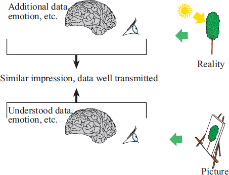
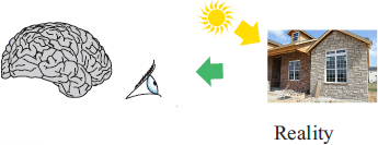
Vision is an ill-posed inverse problem. It is usually assumed that computer graphics is the corresponding direct image generation, and that it is therefore simple. However, to fully account for the diversity of picture styles and to understand the mental processes involved, one has to think of depiction as the inverse of the inverse problem. Indeed, representing a given scene consists in producing a picture that induces a similar impression to beholders as they would have in front of the real scene (Fig. 6). Informally, if we note V(S) the vision operator for a stimulus S, we want V(Spicture)≈V(Sscene) which means Spicture≈V-1V(Sscene). If a strict definition is taken for "similar", and if imaging and vision were invertible operations, depiction would be easy and would be reduced to optical simulation.
Durand continues by noting that vision is,
unfortunately, a very complex operator. It
is not invertible, since the problem is ill-posed.
And, very different stimuli can represent the
same scene, for example a line drawing and a photograph.
This is where he brings in
the Figure 6 referred to above:
In that figure, what does "Similar impression, data
well transmitted" mean? Here's
an example.
In "Drawing as
Translation", under the heading "Detexturing is a generalised
inverse",
I wrote about restoring balance by deleting lines.
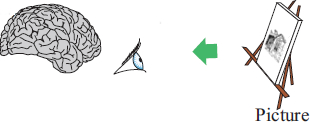
I used this diagram to illustrate what I meant:
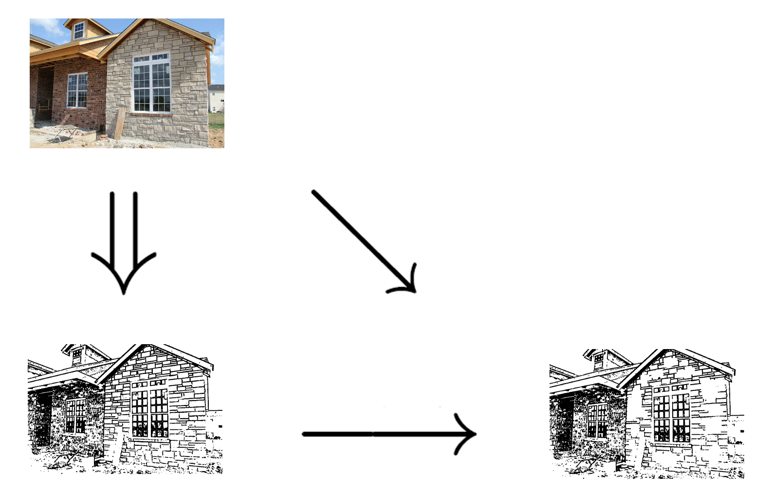
Let's assume the original scene is the house at top left. An artist wants to draw it in pen and black ink, and does so by rendering every line visible, getting the picture at bottom left. But this is poor because his drawing includes all the mortar lines between bricks. The medium of pen and ink forces these to be black, whereas in reality, they'd be a soft mortar grey or whatever. So the language of pen and ink constrains these lines, overpowering the rest of the picture and wrecking its tonal balance. The artist can't soften them, so compensates by doing the next best thing: erasing some and leaving a few disconnected patches of bricks. Because our visual systems are so good at filling in, this restores tonal balance without significantly degrading the message.
So "Similar impression, data well transmitted" does not mean a picture which has been automatically and naïvely translated from reality. That would not, in general, give a "similar impression". Instead, the artist uses "pictorial techniques" to compensate for the medium's inability to convey certain kinds of information. Durand explains this as follows:
Moreover, pictures have limitations compared to the real optical flow [vH81, BM92]: They are flat, of finite extent, often static, and they have a limited gamut and contrast. These additional constraints are most challenging for realistic images. A very important consequence is that the direct recording of the optical flow (i.e. photography) might not result in the most realistic image. This can be due to, e.g., the absence of depth cues, or to the limited contrast. An image where the contrast at the occluding contour is reinforced might provide a more faithful depth impression, because this compensates for the lack of stereovision or accommodation cues. This is an example of pictorial techniques to compensate for the limitation of the medium. A missing cue is rendered through a different perceptual channel (here, stereovision is compensated through occlusion).
Here's an example of occlusion, from page 60 of Jack Hamm's Cartooning the Head and Figure (1967, New York: Perigee):
The dumpy little fellow at the right will serve to illustrate further the walking principle of getting something to lead in front of something else in order to create forward mo- tion. In fig. B one foot is in front, the other behind. In fig. C one arm is in front, the other behind. Naturally, of the two, the lower limb is more important in walking. The arms simply help the stride.
There are only four ways an artist can produce the illusion of forward motion (back to front) in two dimensions: 1. By perspective (things getting larger as they come forward, smaller as they go back), 2. By overlap (one thing in front of another), 3. By values (dark and light) and 4. By color (its several attributes). The cartoonist must use the first two almost exclusively. When one or more cartoon characters are considered apart from their surroundings, item 2. overlap assumes priority over all other ways. In the case of 'Mr. Dumpy' above, the foot overlaps the lower leg, the lower leg overlaps the upper leg, the whole leg overlaps the body and the body overlaps the remaining foot in the rear. NOT ONLY IN THE FRONT VIEW WALK, BUT IN ALL CARTOON ACTIVITY, THE FOREGOING IS MOST SIGNIFICANT.

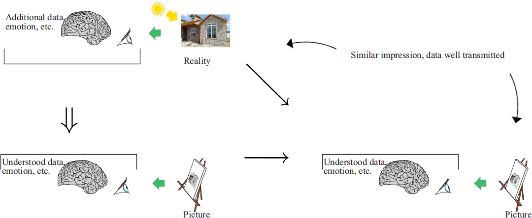
I've expressed the general principle below by combining Durand's Figure 6 with my own diagram. As before, the original scene — the sun-lit house — is at top left. The artist's first picture is bottom left, the double arrow signifying translation from one medium (reality) to another (pen and ink). And the final picture, the one that gives a similar impression to the reality, is bottom right. The single arrow pointing to it signifies reworking within a medium, i.e. the use of "pictorial techniques". The diagonal arrow combines the translation and the reworking.
(I think I want to add something about local vs. global here.)
Durand describes depiction as an inverse, and I used similar language in "Drawing as Translation". I wrote there about undoing some of the effects of translation. I said that we can't undo them exactly, because the medium isn't rich enough. So we do the next best thing. In mathematics, this would be called a generalised inverse. It's an operation that undoes another operation, not exactly, but as closely as the language permits. Below, I'll show how this can be implemented by adding and deleting pictorial cues.
Durand notes that one pictorial technique is the use of occlusion to provide depth cues, making up for the loss of stereoscopy and visual accommodation. Another way to reintroduce depth is described by art instructor Len Doust:
The next essential fact always to have at the back of your mind is "form", or the fact that the figure which you are drawing has thickness as well as outline.
If you study closely the great masters of figure drawing in outline, you will be amazed to discover that they manage to indicate the "form" of a body without the use of shading. How is this done? The secret of these clever drawings is often in certain lines on the figure or head and not actually on the outline — a fold, a collar, a cuff, a crease. Look at these lines carefully, and you will observe that they are very correctly drawn, sometimes even more than the actual outline. A simple illustration of this point is in Fig. E, Plate 12.

Another type of cue is the distortion of facial outline
in the second caricature below, taken from Joyce Grenfell's
My Kind of Magic:

A third, very different, added cue is
the "textual anchoring"
I mentioned in "Aesthetic
Morphisms".
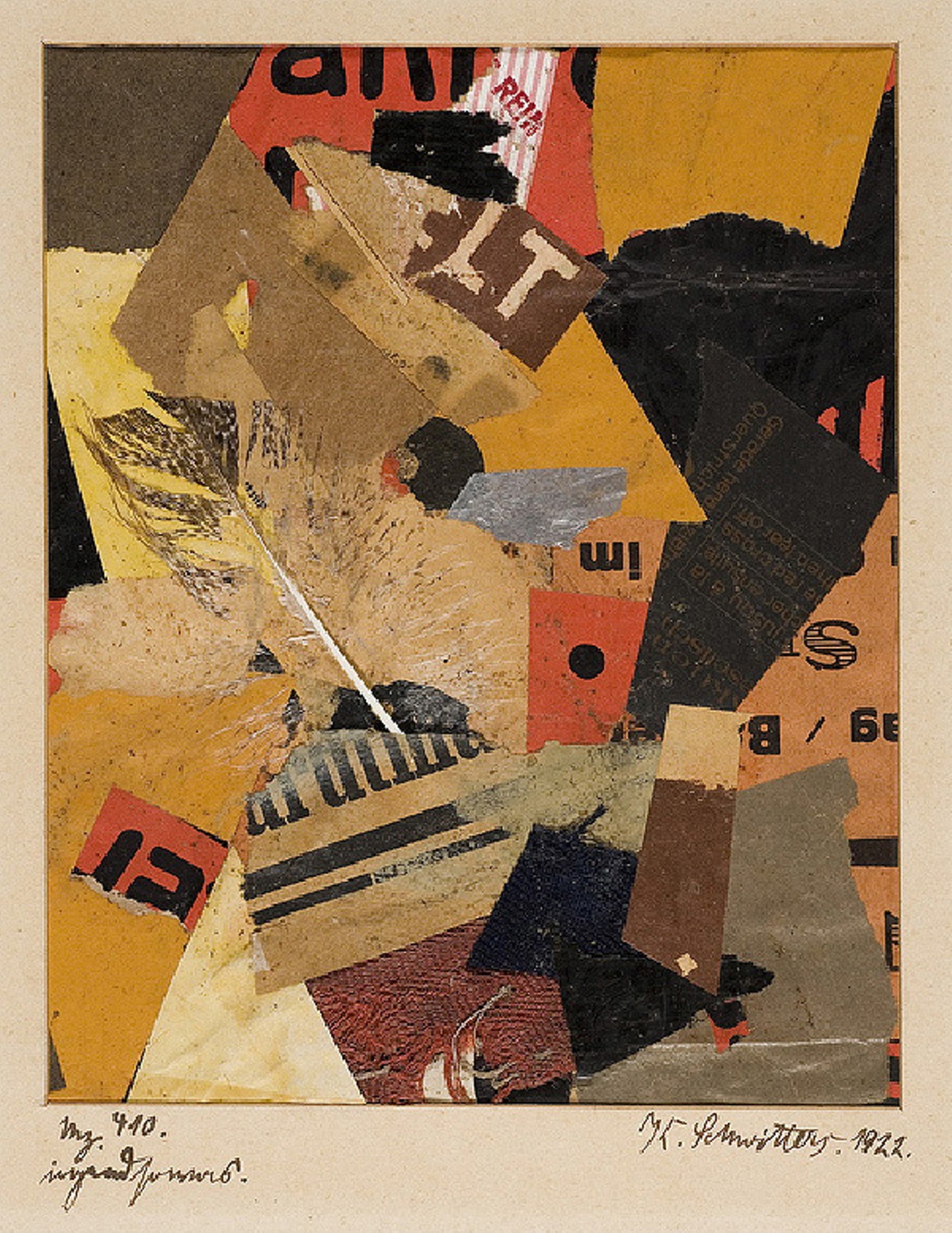
Below is a typical
example,
by Schwitters. The interpretation I've
read is that it helps anchor the
picture in
reality, despite the
distortions.
And a fourth, related but more familiar to the cartoonist,
is the use of
"symbolia":
movement lines, sweat droplets,
obscenity tokens, and other
such symbols for things that can't easily
be depicted directly. The
 and
and
 below
also fall into this category:
below
also fall into this category:

The technique of deleting cues is
very common. Here
it is in use on a lawn-mower catalogue:
And here's another example, from Christopher Hart:
These cheek ruffles — with a large neutral space between them where they meet under the chin — are the most natural looking. The straight line of neutral space serves as good "pacing" between the ruffles. It's a place where the eye can "rest".
In Drawing
as Translation II",
I hypothesised that restoration of aesthetic balance
could be formulated using the category-theoretic
concept of adjunction. Adjunctions give
us very sophisticated tools for talking about sameness.
They can, for example, express the idea that
 and
and
 are
essentially the same. They're not identical, but they
are the same in a deeper sense,
after you take into account their different languages
and the effect on the viewer.
are
essentially the same. They're not identical, but they
are the same in a deeper sense,
after you take into account their different languages
and the effect on the viewer.
Another way to say this is that
the combinations
 and
and
 are
the same when the only thing we're concerned about is
the effect on the viewer.
are
the same when the only thing we're concerned about is
the effect on the viewer.
I'll finish this section with some support from a MathOverflow posting about adjunctions. It's from the thread at https://mathoverflow.net/questions/6551/what-is-an-intuitive-view-of-adjoints-version-1-category-theory , and was posted by Peter LeFanu Lumsdaine (Dec 4 '09 at 21:48):
For a "man on the Clapham omnibus" gloss on it, I think you could do worse than the Stanford Encyclopedia of Philosophy's entry for Category Theory. It describes adjoints as "conceptual inverses", and elaborates on how to see them that way in some of the standard examples.
I guess this is most probably a lower level than you were really asking for. But I think it articulates pretty well one of the less immediately obvious core points of the intuition (at least, my intuition) of what an adjunction is.
Putting this more precisely/abstractly: when we think of generalising isomorphism between objects of a 1-category to something between objects in a 2-category, we might usually think first of isomorphism and equivalence, but adjunction is also such a generalisation.
Right at the beginning, I said I was pleased to find Hertzmann's paper, because he supports my views on optimisation. By doing so, he also gives me another route to my adjunctions hypothesis. This is because it's already known that adjunctions can model optimisation. Ideally, I would demonstrate this by proving it. However, I don't have time, so instead I'm going to appeal to authority. The two excerpts below are from the MathOverflow thread I've already cited, and are by Andrew Critch (Nov 23 '09 at 10:14) and Greg Stevenson (Nov 23 '09 at 10:41). First, Andrew Critch:
An adjoint functor is a way of giving the most efficient solution to some optimization problem via a method which is formulaic ... For example, in ring theory, the most efficient way to turn a rng (like a ring with no identity) into a ring is to adjoin an element '1' to the rng, adjoin no unnecessary extra elements (we will need to have r+1 for each r in the ring, clearly), and impose no relations in the newly formed ring that are not forced by axioms. Moreover, this construction is formulaic in the sense that it works in essentially the same way for any rng.
The intuitive description of this construction as "most efficient" means "satisfies a universal property" (in this case an initial property), and that it is intuitively "formulaic" corresponds to it being functorial, making it an "adjoint" "functor".
In this asymmetric interpretation, the theorem (if you define adjoints via universal morphisms) that adjoint functors occur in pairs has the following intuitive meaning:
"The notion that F is the most efficient solution to the (optimization) problem posed by G is, in a certain rigorous sense, equivalent to the notion that G poses the most difficult problem which F solves."
And now Greg Stevenson:
Suppose that F: C→D is a functor. Then there are many situations in which thinking of finding left and right adjoints to F as solving approximation problems is very good intuition. So these would constitute functorial ways to approximate objects in D relative to the image of F by objects in C either on the right or the left. I'm not sure I've really managed to word this in a way that conveys what I have in my head but here are some examples (which I have picked because they have a particularly 'approximationy' flavour but I do think that this works reasonably well in general anyway, I think my selection bias here is more skewed toward what I think about regularly).Torsion theories are very good examples of this principal. For instance the notion of localization with respect to a homology theory in the homotopy category of spectra or more generally the approximating triangles coming from the acyclization and localization functors of a semi-orthogonal decomposition of a triangulated category. Another nice example along these lines is say the standard t-structure on the derived category of modules over some ring. Here we again have two pairs of adjoints and we can think of one as a right approximation by a bounded below complex coming from the unit and the other as a left approximation by a bounded above complex via the counit.
One can also view resolutions in the derived category in this way. For instance we have a right adjoint to the canonical map from K(InjR)→D(R) for a ring R where the first category is the homotopy category of complexes of injective R-modules which is taking K-injective resolutions. Similarly other sorts of resolutions, envelopes, and covers can be realised by adjunctions.
All of these examples are particularly nice in the sense that we get triangles or short exact sequences describing the object we start with in terms of our complementary approximations (by complementary I mean that there is orthogonality floating around in all of these examples so we have in some sense decomposed our category).
I think things like the adjoint functor theorem and Brown reprensentability become very reasonable from this point of view. One can loosely interpret them as saying provided things are "small enough" to be manageable and one has enough limits/colimits then one can build universal approximations (i.e. adjunctions) by taking coarse approximations and refining them.
I think this philosophy works well with the one given on the wiki page that Andrew Critch linked to.
To end, I'll note that I've come across a lot of books on drawing which advise that you shouldn't force a style for yourself; it will come gradually as you learn. That may be partly true, because drawing is a physical activity and entails learning neuromuscular habits.
But style is also about choosing a medium and a graphic language to use with it. Any graphic language will make some things easy to represent and others hard. The hard things can be compensated for by using pictorial techniques. There are trade-offs for each style, and these can be consciously compared. So to that extent, one need not let style happen. One can choose it, analysing the choice as a problem in optimisation.